- Victorian Interior Design: Creating Authentic Period Elegance in Your Home - September 6, 2025
- Why I’m Obsessed with Rococo Interior Design (And You Should Be Too) - September 4, 2025
- Hollywood Glam Interior Design: Bringing Old Hollywood Luxury Home - September 2, 2025
Table of Contents
So here’s the thing. Back when I was fresh out of design school, we’re talking 2003, frosted tips were still a thing. I thought classical interiors were basically interior design for dead people. Give me clean lines! Industrial elements! Make everything white and call it sophisticated!
Then Mrs. Henderson happened.
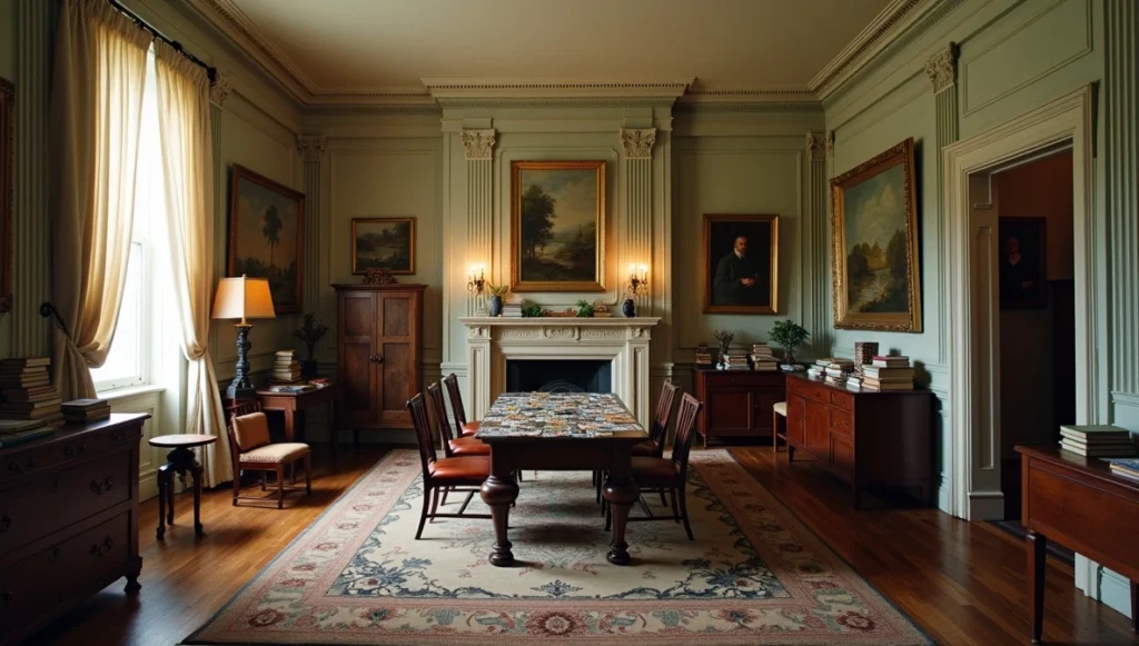
I was maybe six months into my first job when my boss sent me to photograph this Fifth Avenue apartment. The client was this elegant woman in her seventies who’d lived in the same 1920s space for forty years. I walked in expecting some dusty museum piece. Instead? Pure magic. Yes, there were columns and crown molding and all that classical stuff. But her granddaughter’s finger paintings hung right next to what looked like actual Renoirs. Books were pulled off shelves and stacked everywhere. The fancy dining room had a thousand-piece jigsaw puzzle spread across the mahogany table.
I stood there like an idiot, realizing I’d completely misunderstood what classical design could be. Twenty years later, I’m still trying to nail that balance. I do have the photo of this treasure..sharing it with you, here it is..
What Neo-Classical Actually Means (Not What You Think)
Quick history lesson that’s actually interesting, I promise. Neo-Classical design started because wealthy Europeans in the 1700s got super excited about archaeology. They were digging up Pompeii and finding all this incredible Roman stuff, and suddenly everyone wanted their house to look ancient and important.
But here’s where it gets smart: architects like Robert Adam didn’t just slap temple columns onto English country houses. They looked at WHY classical design worked – the proportions, the symmetry, the attention to detail – and figured out how to scale it for actual human beings. That’s still what I do today. I’m not building the Parthenon in your living room. I’m stealing the best ideas from classical design and making them work for families who need their houses to function.
The Stuff That Actually Matters
Columns (But Not Where You Think)
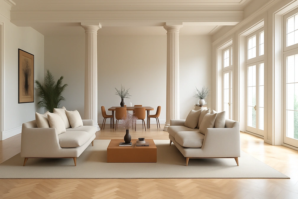
Everyone assumes they need columns everywhere. Nope. I did this project last year where the clients had this boring open-plan space. Added two simple Doric columns right at the transition point between living and dining areas. Didn’t block the flow, but suddenly you had these distinct spaces that felt intentional.
The secret? Matching your column size to your ceiling height. I see people trying to cram massive Corinthian columns into spaces with nine-foot ceilings. Looks ridiculous. Simple pilasters work way better in most homes.
Moldings (Less Drama, More Impact)
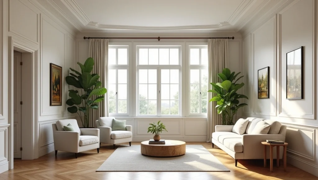
Crown molding is like the perfect accessory. It can make everything look more expensive, but you can definitely overdo it. I had this client who wanted elaborate egg-and-dart molding in every room. I talked her out of it, thank god. We went with clean, simple profiles instead, and the house feels elegant instead of like a wedding cake factory exploded.
Colors That Don’t Bore People to Death
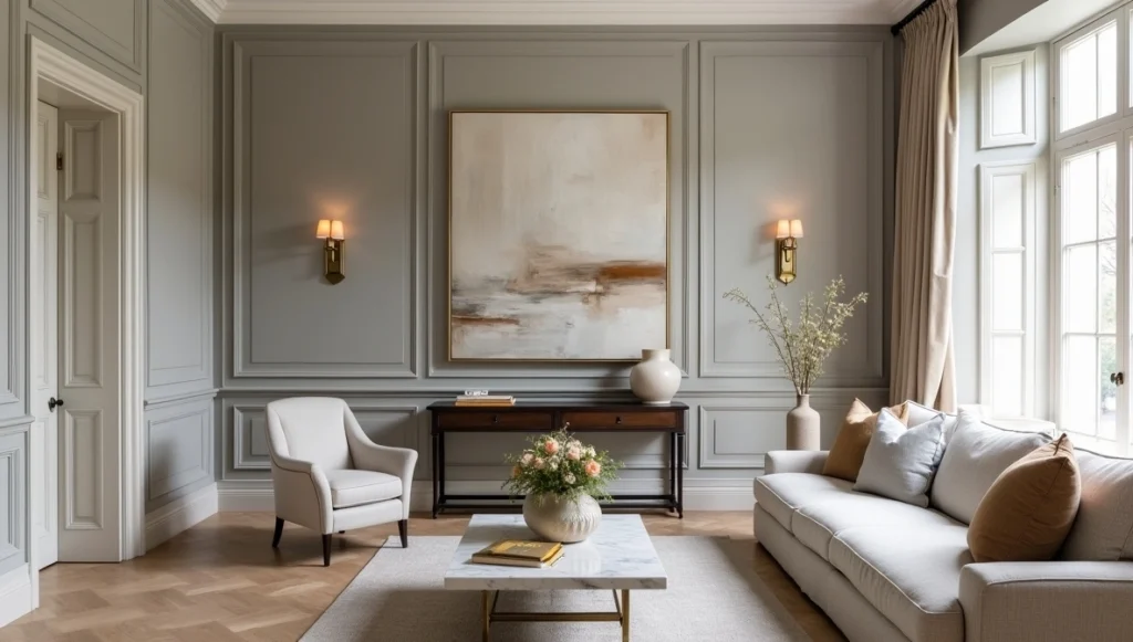
Early career me was all about those safe museum whites and beiges. So boring. Now I’m obsessed with Farrow & Ball’s “Elephant’s Breath”, ya its a terrible name, but it’s this perfect warm gray that somehow makes everything else look more expensive.
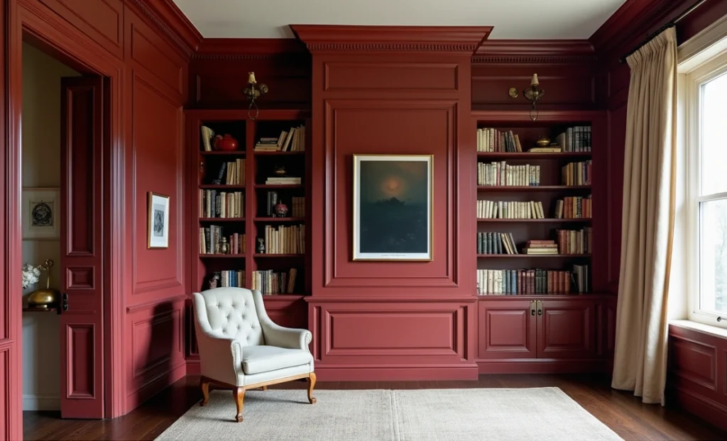
I also did a library last month in gorgeous deep wine red with gold accents. Client was terrified it would be too dark. Now she texts me photos of herself reading in there because she loves it so much.
Furniture – The Mix-and-Match Game
Real 18th-century antiques are stunning. They’re also insanely expensive and about as comfortable as sitting on a rock. My strategy: one gorgeous antique piece per room for credibility, then fill in with quality reproductions that handle real life.
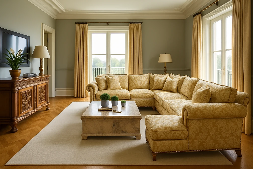
Best trick ever: take modern furniture with good bones and dress it up. Had a client’s plain sectional reupholstered in silk damask with brass nail heads. Looked like it belonged in a French château, but you could still sprawl on it with pizza and not worry about ruining anything priceless.
Materials – Where Your Budget Actually Matters
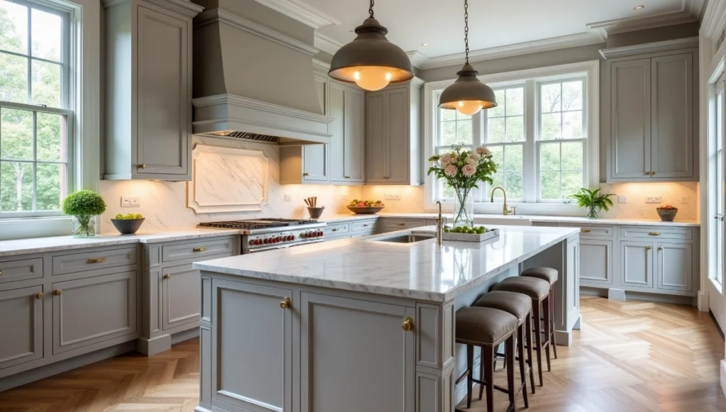
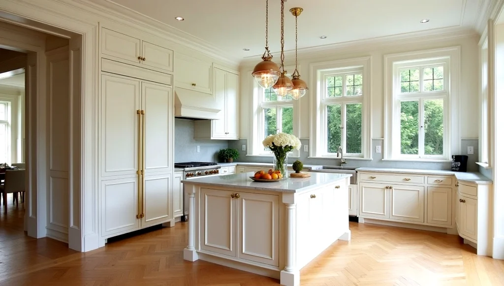
Stone is the holy grail of classical design, but let’s be realistic about where it makes sense. In kitchens, I use real Carrara marble on islands (perfect for baking) and convincing quartz that looks like Calacatta for work areas where people are actually chopping vegetables. Your guests won’t know the difference, but your wallet definitely will. Take a look at the the kitchen I designed for my client recently.
For wood, mahogany screams traditional but can feel heavy in smaller spaces. My secret weapon is walnut – rich enough to feel luxurious, warm enough to be welcoming. Save real silk damask for dining rooms and master bedrooms where it won’t get destroyed by daily life. Family spaces get high-quality cotton with classical patterns that survive grape juice accidents.
How This Works in Real Rooms
Living Rooms – Where Everyone Actually Hangs Out
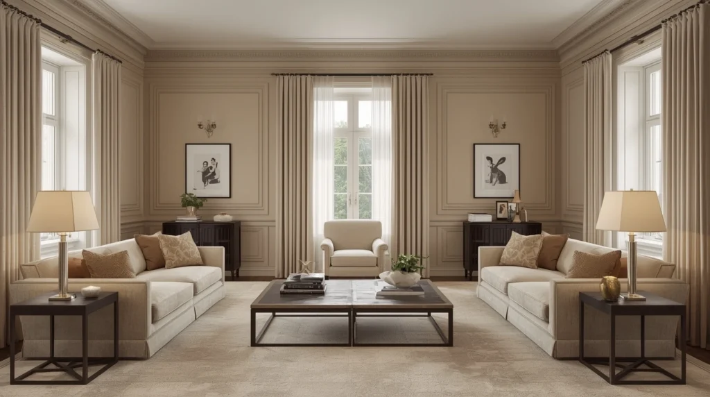
Start with symmetry. Matching sofas facing each other, identical side tables, balanced lighting. Then layer in the stuff that makes it home: family photos, books you’re actually reading, that weird ceramic bowl your kid made in pottery class. Always include at least one supremely comfortable reading chair. I learned this the expensive way after designing a gorgeous living room nobody ever used because every seat was chosen for looks over comfort.
Dining Rooms – For Real Meals, Not Instagram
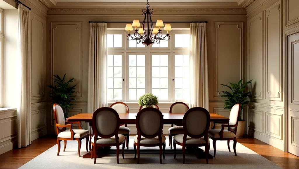
In my experience, a neoclassical dining room works best when the proportions feel calm and balanced. A rectangular table keeps the flow natural for conversation, and the simple molding details give the room quiet elegance. It’s formal enough for special dinners but still feels comfortable enough that people actually want to linger at the table.
Kitchens – The Impossible Room
This is where classical design gets really tricky. I start with classical cabinet proportions – raised panels, proper hardware, maybe columns to break up long runs. Then I spend most of my time hiding modern necessities. That enormous refrigerator gets panel fronts matching the cabinets. Microwave disappears into a custom cabinet. The goal is a kitchen that looks timeless but functions for how we actually cook today.
Bathrooms – Your Private Spa
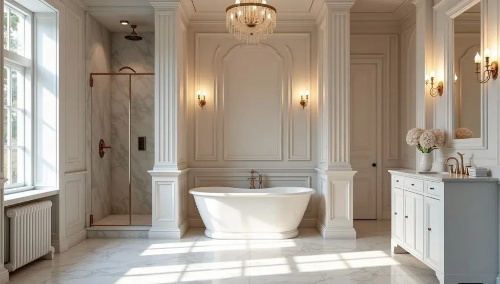
Freestanding tubs positioned like sculptures become focal points. I love creating little alcoves with columns to make them feel intimate. My compromise on marble: real stuff for vanity tops and floors, convincing ceramic tile for shower walls. Nobody will know unless they’re running their hands along walls, which would be weird anyway.
Home Offices – The Accidental Star of 2020
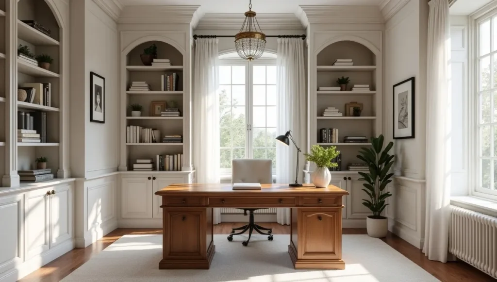
The pandemic made home offices essential overnight, and classical principles actually work great here. Built-in bookcases with traditional detailing create impressive Zoom backgrounds while giving you actual storage for all your stuff. A substantial desk with classical proportions makes work feel important instead of like you’re doing spreadsheets at the kitchen table.
Kids’ Rooms – Planning for the Long Game
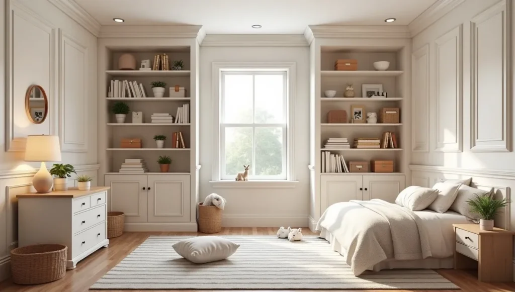
This is where I think like a chess player, planning several moves ahead. Create classical bones that evolve: simple crown molding, built-ins with adjustable shelves, neutral paint colors that work for any age. Then layer in fun stuff that changes easily. Skip cartoon character wallpaper that’ll look dated in two years. Use classical stripes that work whether the kid is five or fifteen.
Mistakes I’ve Made (Learn from My Pain)
The “More is More” disaster was my biggest early lesson. I thought more classical details automatically meant better design. Spoiler alert: absolutely wrong. I once did a dining room with so much molding it looked like a theme restaurant. Restraint is everything in classical design.
Then there’s ignoring how humans actually live. That formal living room nobody uses isn’t good design, it’s expensive art installation. Even the most classical spaces need to accommodate real life – people need comfortable seating and room to move around.
Getting scale wrong kills everything. Tiny crown molding in rooms with twelve-foot ceilings just disappears. Massive chandelier in a small dining room overwhelms everything else. Classical design is all about proportional relationships, and scale matters more than any other single element.
Making Classical Design Work in 2024
Modern life requires modern technology, but nobody wants to stare at it in their beautiful classical rooms. I design custom millwork that hides speakers, TVs, and smart home gadgetry while keeping perfect classical proportions. That giant flat-screen disappears behind sliding panels that look like traditional paintings. Everything functions perfectly but stays invisible.
Not everyone can afford complete renovations, but strategic updates create amazing transformations. Crown molding instantly makes any room look more sophisticated. Painting existing furniture in classical colors pulls mismatched pieces together. Simple window treatments in quality fabrics dramatically improve the elegance factor. I completely transformed one client’s bland apartment living room with just paint, crown molding, and carefully chosen accessories. Total cost under three thousand dollars, result looked like a thirty-thousand-dollar renovation.
Where to Actually Spend Your Money
Custom millwork is where you don’t cut corners. Properly proportioned crown moldings, built-ins, and architectural details create the bones everything else builds on. Cheap, poorly proportioned millwork looks obviously cheap and ruins the whole effect.
For furniture, buy the absolute best dining table and seating you can afford because these should last decades. I have clients still using pieces I helped them choose fifteen years ago. Good furniture is an investment, not an expense.
Nothing destroys classical ambiance faster than terrible lighting. Quality fixtures with proper proportions make every other element look more expensive, while cheap lighting makes even genuine antiques look fake.
Why This Style Never Dies
After twenty years of watching design trends cycle through, I finally understand why Neo-Classical design has such staying power. It’s based on principles that connect with something fundamental about how humans perceive beauty: proportion, symmetry, quality materials, attention to detail. These aren’t arbitrary rules, they’re based on how our brains process visual information.
My clients always describe their classical rooms the same way: impressive enough for entertaining, comfortable enough for quiet nights with a book. That balance between grandeur and livability defines truly successful design. The Neo-Classical interiors I’m creating today will still look elegant in fifty years, just like the best examples from previous centuries continue inspiring us now.
That’s the ultimate test of any design philosophy – not whether it’s trendy right now, but whether it’ll still feel right when your grandkids are adults. Understanding these classical principles lets us create spaces that honor centuries of design wisdom while working perfectly for contemporary life.
Turns out Mrs. Henderson was right all along.
