- The Unexpected Magic of Boho Scandi: Why This Fusion Style is Taking Over Modern Homes - September 2, 2025
- Japandi Design: Why This Japanese-Scandinavian Hybrid Has Taken Over My Client Projects - September 2, 2025
- The Real Story Behind Transitional Interior Design: Why It Actually Works - September 1, 2025
Table of Contents
So there I was in 2005, fresh out of design school, thinking I knew everything. A client walks in and says she wants her living room to look “like Don Draper’s office but livable.” I literally rolled my eyes. Another rich lady wanting to play dress-up with expensive vintage furniture. 20 years later? I owe that woman an apology. Mid-Century Modern isn’t going anywhere, and I finally get why.
The Lightbulb Moment
It hit me around 2010 when I was helping this young couple with their tiny Brooklyn apartment. They had no money, barely any space, and a baby on the way. Traditional furniture was making their place feel like a shoebox, so we went Mid-Century Modern by accident. Low furniture that didn’t block sight lines, a credenza that hid their TV and junk but didn’t tower over everything. Suddenly their 600-square-foot place felt twice as big. That’s when it clicked – this isn’t about recreating the 1960s. It’s about solving problems that never went away.
What Those 1950s Designers Actually Figured Out
After World War II, everyone was dealing with smaller houses, less money, and families that needed flexible spaces. Sound familiar? The Eames couple weren’t just making pretty chairs, they were engineering solutions for real life. Take their storage units – modular pieces you could reconfigure when your needs changed, furniture that looked good but actually worked, materials that were honest about what they were instead of trying to look expensive. Basically, they invented the concept of “good design for everyone” instead of just “fancy stuff for rich people.” They understood that good design should make life easier, not more complicated.
My Crash Course in Making This Actually Work
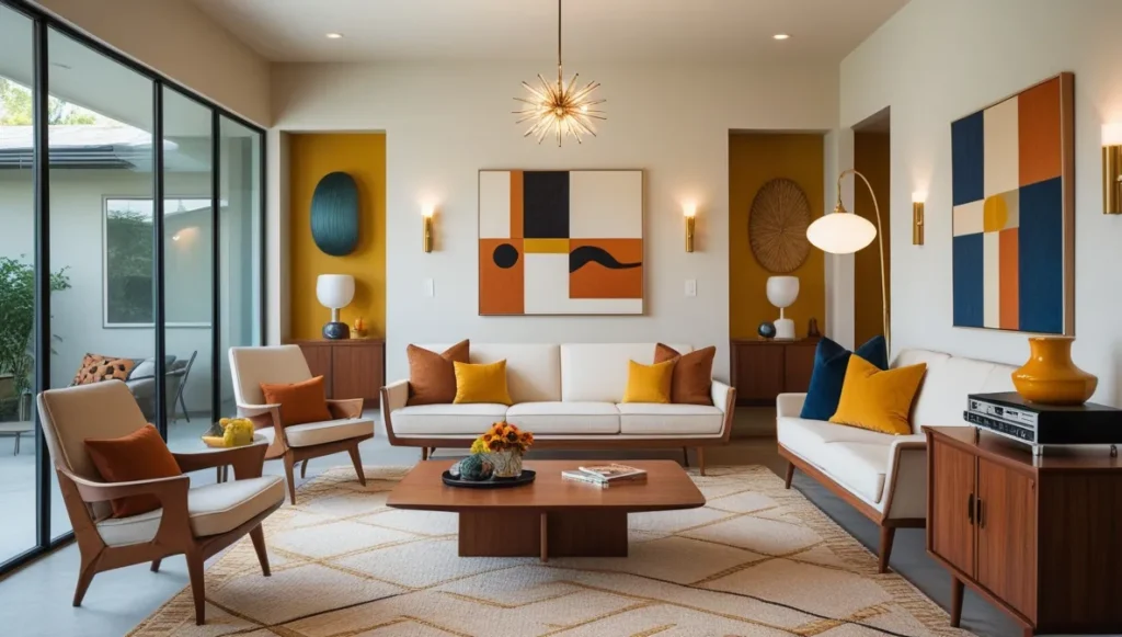
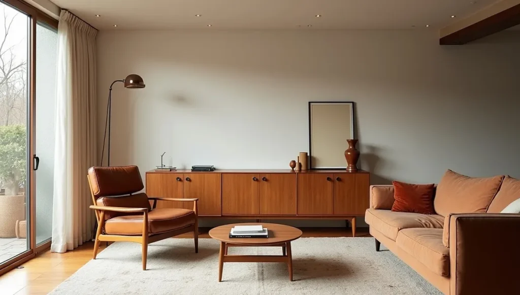
Living Rooms (Where I Learned Everything)
That Brooklyn couple taught me the low furniture trick. When everything sits close to the ground, your ceiling looks higher and the room feels bigger – it’s basically magic. I always do one statement piece now, usually a chair with some personality. Not necessarily expensive, just something that makes you happy when you look at it. Last month I found this amazing leather and wood chair at an estate sale for 200 bucks that looked like it cost ten times that. The credenza thing is non-negotiable though – you need that long, low cabinet that eats up all your visual clutter while giving you space to put a few things you actually like looking at.
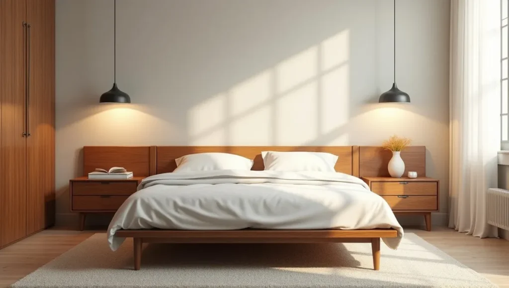
Bedrooms (Less Is Actually More)
Platform beds or simple headboards – that’s it. I spent years trying to talk clients into elaborate headboards until I realized the simple ones just work better because your eye isn’t fighting with a bunch of competing elements. Nightstands on legs instead of those chunky bedside tables that hit the floor make everything feel lighter somehow. And pendant lights instead of table lamps free up your nightstand for stuff you actually need, like your phone charger and that book you’re never going to finish.
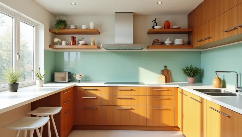
Kitchens (The 50-Dollar Makeover)
Here’s something nobody tells you – you can get 80% of the Mid-Century look just by changing your cabinet hardware to those long horizontal pulls instead of knobs. Costs maybe 50 bucks and completely changes how your kitchen feels. Pick one color for accents and stick with it though. I learned this the hard way after a client wanted orange bar stools AND a turquoise backsplash AND yellow appliances. It was… a lot. Open shelving works if you’re naturally neat, but if you’re not, it just looks messy. Be brutally honest with yourself about this one.
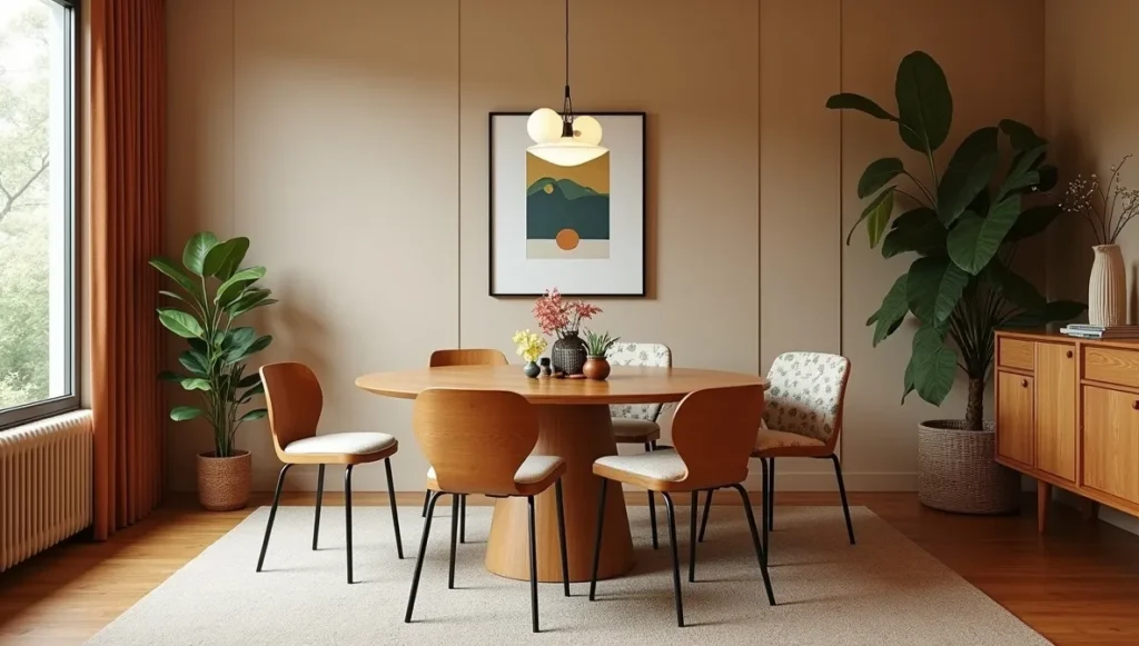
Dining Rooms (Where People Actually Gather)
Round tables get people talking more, I don’t know why, but it’s absolutely true. The base matters more than the top though, so look for hairpin legs, angled supports, something with visual interest that draws the eye. Mix your chairs too – four matching ones plus two upholstered in some fun fabric looks way better than a perfect set. I learned this from a client who couldn’t afford six matching chairs and accidentally created the best dining room I’d ever done.
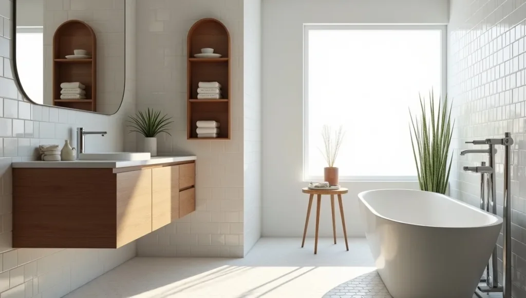
Bathrooms (Keep It Simple)
Floating vanities are your friend here, along with simple tiles like subway, hexagon, or basic squares. Chrome fixtures that don’t try too hard to be fancy work best. And here’s my secret weapon: add one piece of wood somewhere, whether it’s a shelf or a mirror frame, something to warm up all that chrome and tile. It makes all the difference between sterile and sophisticated.
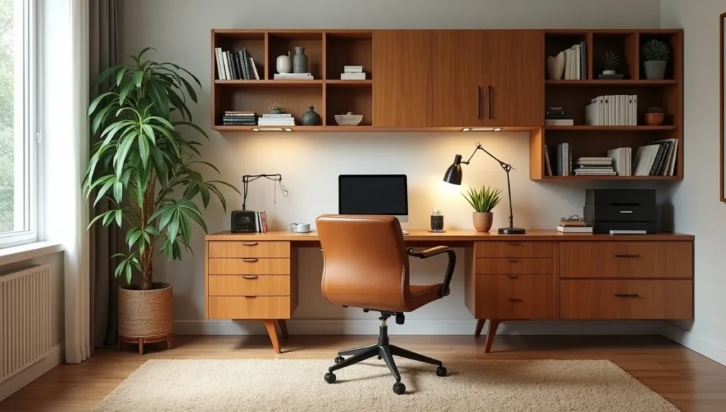
Home Offices (For Our Work-From-Home Reality)
Get a desk with interesting legs or build one into a credenza for that integrated look. Those modular wall systems where you can move shelves around are perfect for changing needs, especially if you’re like most people and your work setup evolves constantly. Filing cabinets that look like furniture instead of office equipment are a total game changer, after all, nobody needs their home office to look like a corporate hellscape.
Colors That Don’t Scream “Time Machine”
Forget what you think you know about orange and brown being mandatory. Start with neutrals – white, gray, natural wood – then add colors you actually like. Could be burnt orange, could be forest green, could be that soft pink everyone’s obsessing over now. The trick is restraint though – one or two colors max, or it gets crazy fast and you’ll end up looking like a 1970s diner instead of a sophisticated modern home.
Where People Go Wrong
The biggest mistake is putting stuff everywhere because they think more equals better, but this style needs breathing room or it doesn’t work at all. People also get proportions wrong constantly – everything should feel horizontal and grounded, so that tall skinny bookshelf from IKEA gives off completely the wrong vibe. The other major error is trying to make it a perfect museum instead of a place where people actually live, breathe, and spill coffee on things.
How to Do This Without Spending Your Kid’s College Fund
Real talk time: most of my best Mid-Century rooms used zero authentic vintage pieces. Target, West Elm, Facebook Marketplace, DIY projects, whatever works for your budget and lifestyle. I’ve made coffee tables by putting hairpin legs on wood slabs, reupholstered thrift store chairs in bold fabric, and changed cabinet hardware and called it a complete transformation. The secret isn’t buying expensive stuff, it’s understanding what makes something look right and finding affordable versions that capture the same feeling.
Why This Stuff Never Gets Old
I’ve watched so many design trends come and go over the years. Remember when everyone wanted their kitchen to look like Tuscany? Or when barn doors were on literally everything for about five minutes? But Mid-Century Modern just keeps chugging along, and I think it’s because those original designers cared more about making life easier than making Instagram-worthy photos. When you design for function first, it tends to stick around because the underlying human needs don’t change.
Plus, we’re all still dealing with small spaces and wanting our homes to feel bigger than they are. The solutions from the 1950s still work because the problems haven’t really changed – we still need storage, we still want our spaces to feel open and airy, and we still can’t afford to waste square footage on furniture that’s just for show.
My Big Confession
I was totally wrong about this being a rich person’s trend that would fade away like so many others. Turns out when you strip away the fancy marketing and expensive reproductions, Mid-Century Modern is actually about making good design accessible to everyone. Those designers from 70 years ago were trying to solve the same problems we face today – how to live well in small spaces without spending a fortune on furniture that doesn’t actually make your life better.
Maybe that’s why this style refuses to die, even when design magazines try to declare it over every few years. Who would have thought that the key to timeless design was just… solving real problems for real people? Sometimes the most revolutionary thing you can do is make life a little bit easier and more beautiful at the same time.